
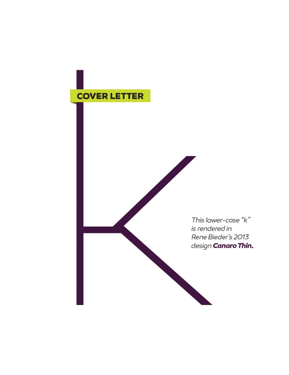
There’s an understated confidence to a thin(ner) stroked, extended letterform that’s very appealing. When the stroke is heavier, it can look loud, like a shout. But keep it thin, and it marks its place with the assurance that it belongs there. This lower-case k is a perfect example of that. If you’d like to review all the letters in the series, you can do that here. You can also download a PDF version of this weeks letter here.
Cover Letters – k
0 likes
Leave a Comment