
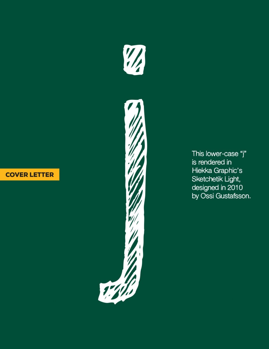
This lower-case j is looking particularly sketchy, which is a terrible pun, but there you are. I’ve seen fonts like this on “back-to-school” sale posters all over. I think it works better for selling clothing than it does for office supplies, but maybe that’s just me. If you’d like to review all the letters in the series, you can do that here. You can also download a PDF version of this weeks letter here.
Cover Letters – j
0 likes
Leave a Comment