
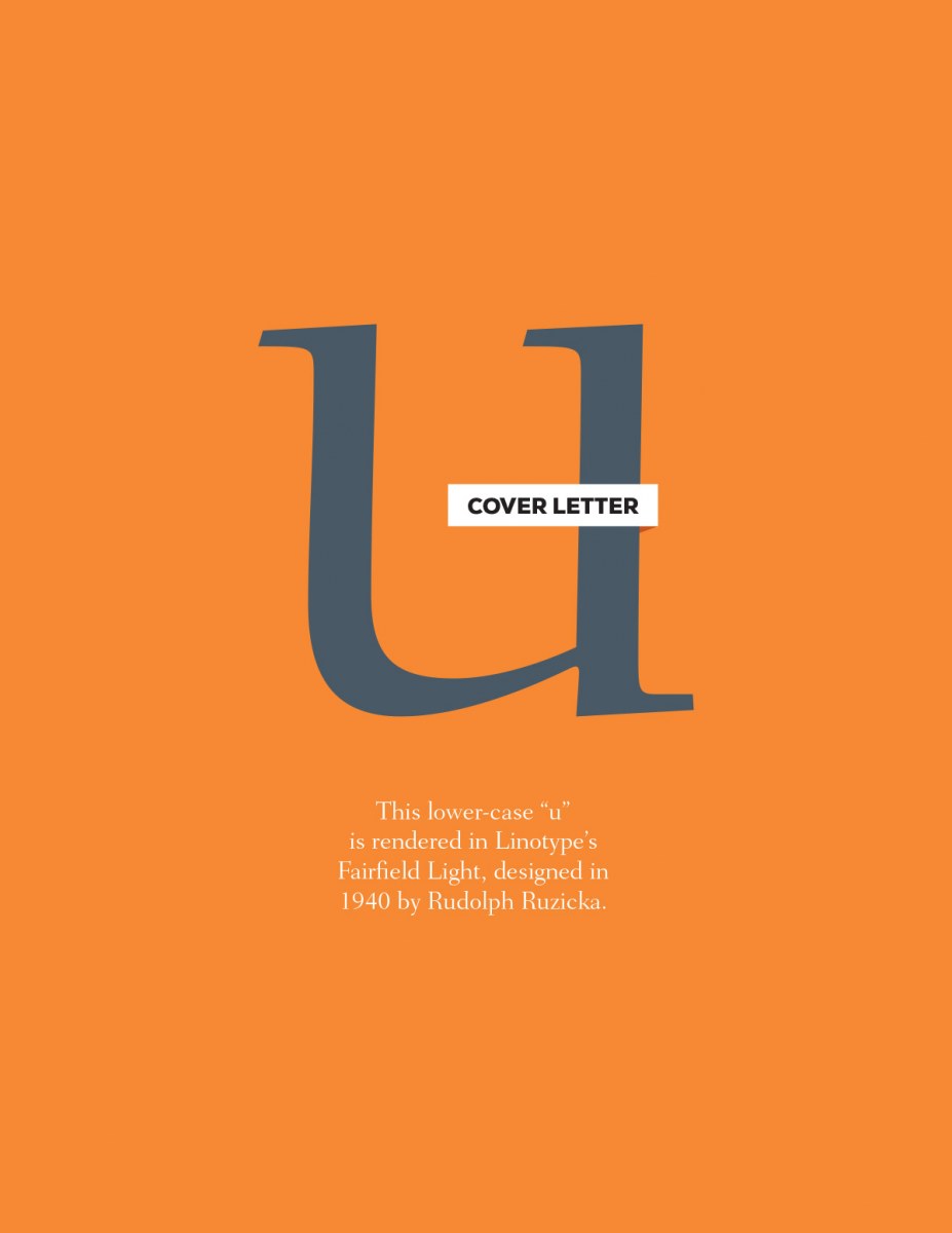
I’ve been thinking a lot about serifs recently, in particular about how their ornamentation actually serves a very practical purpose in aiding legibility. In the case of this lowercase “u,” the top serifs help lead you into the letter, while the bottom right serif both concludes the letter and points you towards the next one. Neat stuff. If you’d like to review all the letters in the series, you can do that here. You can also download a PDF version of this weeks letter here.
Cover Letters – u
0 likes
Leave a Comment