
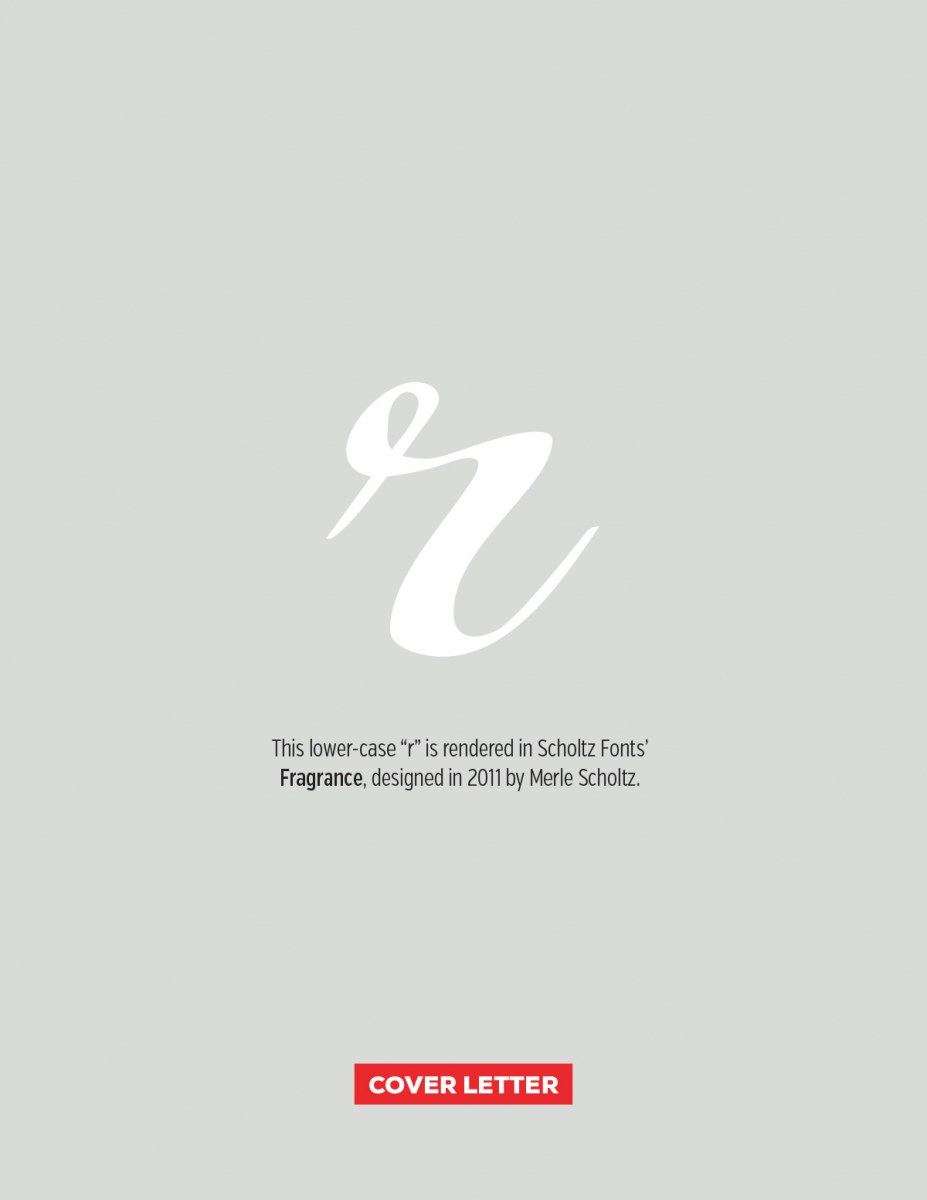
In the context of a word, the fact that the cursive “r” is missing it’s left stroke isn’t a big deal, as it can lean on the letter next to it. Standing alone like this, it looks a bit odd balanced on the right like this. If you’d like to review all the letters in the series, you can do that here. You can also download a PDF version of this weeks letter here.
Cover Letters – r
0 likes
Leave a Comment