
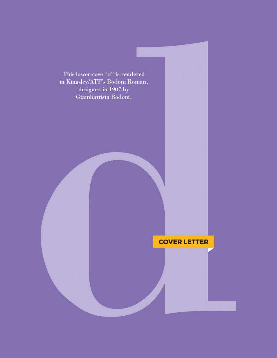
The letter “d,” fashionably rendered in Bodoni. Bodoni always makes me think of fashion magazines and Audrey Hepburn. It has a sort of natural elegance about it, which I think is rare in a serif. Usually, the idea of elegance is conveyed with a script. That said, if I were typing Audrey Hepburn, I’d use Bodoni Light rather than Bold. If you’d like to review all the letters in the series, you can do that here. You can also download a PDF version of this weeks letter here.
Cover Letters – d
0 likes
Leave a Comment